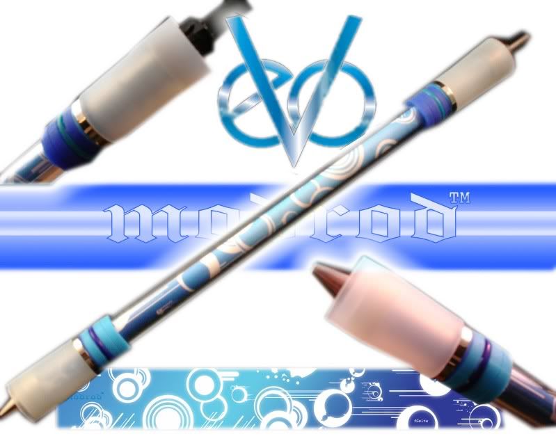
UPSB v3
Temporary Bin / From: Show Off Your modrods | Mod the Rod
From Topic ID: 21522
-
Date: Thu, Nov 5 2009 15:54:39
Spoiler:
Okay so Ive been seeing cris's and barrets designs and they look pretty awesome. But the pictures didnt do much justice and I didnt know why. So i did some snoooping and saw that a high majority of really nice mods have a white or 'light' background. So i wanted to see if the blueprint picture might look better if there was a white background
So i played with photoshop

IMO it looks more appealing, but thats just me. I recoloured the modrod logo, if cris/barret always want that green/yellow then sorry i was just trying to make it fit. This is just an example to show how it can look different with a light background
Could be fixed up a little bit i guess, but its fine to show what im trying to show
AndQUOTE (Nachoaddictionftw)Just wish they lasted a long time and didn't need to be "charged". Glow sticks don't do thisBut glowsticks run out eventually. I rather the idea of being able to charge them than buying newones all the time