UPSB v3
Off-topic / photoshop pros
help
-
Date: Sun, Jan 10 2010 03:05:47
we need to have a logo for our site...
http://www.ppsc.darkbb.com
pinoy pen spinning community
sadly only 2 of us were able to think of a logo
can you please try to fix these??
just clean the edges thx...and if you can pls make another copy w/ the C as blue, S as red then the holes as yellow
this one can you pls make it look computerized?thx
and this one can you make it look similar to UPSB's logo? like gold then has little shading etc..
thanks to anyone who would like to help -
Date: Sun, Jan 10 2010 03:15:45
not to be offensive, but I think the current logo is better than these =/
-
Date: Sun, Jan 10 2010 03:21:11QUOTE (MinEste @ Jan 10 2010, 11:15 AM) <{POST_SNAPBACK}>not to be offensive, but I think the current logo is better than these =/
we have no logo -
Date: Sun, Jan 10 2010 06:58:49
Not all logos consist of letters making shapes/other letters.
These types of logos are boring. -
Date: Sun, Jan 10 2010 13:59:57
Hey
I did 2 versions for each requested -- one with sharp edges, other with blurred edges;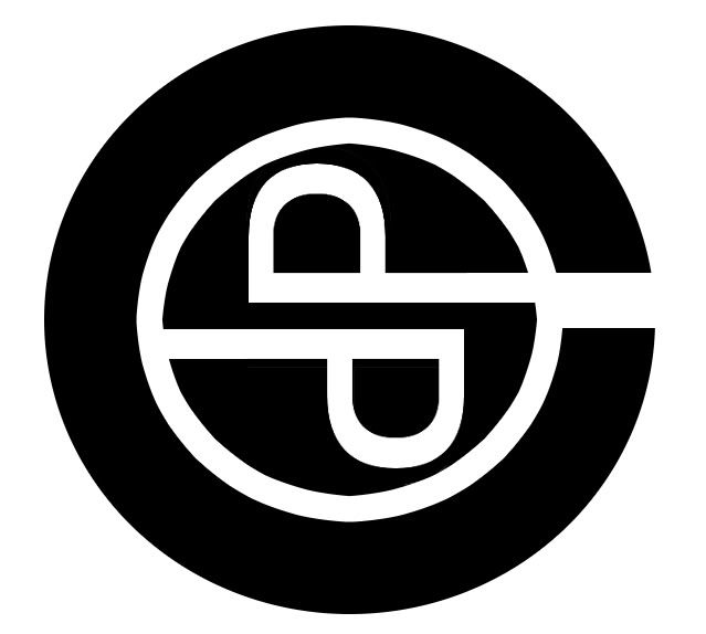


This isn't the final version, this is a quick thing I put together, just checking if this is kinda the thing you mean? More shading? And obviously Ill fix it up, its just to see