UPSB v3
East Coast Spinners / Logo Contest!
With a Prize!
-
Date: Wed, Jun 11 2008 00:43:34
Who ever submits the BEST logo voted on by judges will be a moderator on either this board or our makeforum board.
Deadline: July 4th
Judges: Me, Huroni, Dynamik and Mhig
Send your pics to me in a PM anytime. -
Date: Wed, Jun 11 2008 19:25:57
is the makeforum board still up?
-
Date: Wed, Jun 11 2008 19:28:17
I'll attempt to make a logo (or 2)
-
Date: Wed, Jun 11 2008 20:07:04QUOTE (Dynamik @ Jun 11 2008, 03:25 PM) <{POST_SNAPBACK}>is the makeforum board still up?
nope
-
Date: Fri, Jun 13 2008 19:37:54
wait is this a logo on the forum or a sig, or both
-
Date: Sat, Jun 14 2008 13:45:52QUOTE (someone @ Jun 13 2008, 03:37 PM) <{POST_SNAPBACK}>wait is this a logo on the forum or a sig, or both
both. the logo could be resized if needed -
Date: Sat, Jun 14 2008 14:39:28
Can I make a separate image for the logo then, since the one I sent is meant to be a sig and would look crappy if resized?
-
Date: Sat, Jun 14 2008 15:07:38
ya seperate would be good too.
i made this one. i didnt know what colors to put, any suggestions?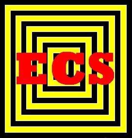
-
Date: Sat, Jun 14 2008 15:20:51
ecs should have a color scheme, a new one, not the old white, orange and black
any suggestions? -
Date: Sat, Jun 14 2008 15:46:48

This is the one I made for sig. (making one for logo atm)
EDIT:
logo, still unsatisfied I guess this is a draft -
Date: Sat, Jun 14 2008 16:52:46
i vote someone as the winner O_O
-
Date: Sat, Jun 14 2008 17:09:02

final -
Date: Sun, Jun 15 2008 17:45:15
someone wins. those r really good
-
Date: Mon, Jun 16 2008 23:33:56
hey someone, do u think u can make an avatar sized logo. but instead of the ones u previously posted, like a more simple one. like these, for example.


-
Date: Mon, Jun 16 2008 23:40:17
I'll try sometime tomorrow. Is around 100x100 a good size?
-
Date: Tue, Jun 17 2008 01:22:00
ya
-
Date: Tue, Jun 17 2008 02:19:14

uh I just did a draft
what should I change? would you prefer a completely different design?
sorry I'm not so good with vectors lol -
Date: Wed, Jun 18 2008 14:26:57
its kind ahard to see the "C". but it looks good.
-
Date: Thu, Jun 19 2008 00:12:41
wait so do I win?
-
Date: Thu, Jun 19 2008 23:06:24
I'd make the C more visible

But I still say you win, if anyone counts what I think. -
Date: Fri, Jun 20 2008 15:08:01
you win 8D